Monday, December 19, 2011

The White Filly 6" x 6" oil on gessoboard


The little filly was painted using various shades of light grays. From cool pinks and violets to warm yellow ochres. It helped tie the bottle and the flower together.

Wednesday, December 14, 2011

Stage Left 6" x 6" oil on gessoboard


Breyer horses are so great to paint. They are the next best thing to a live model.


After a few minutes, I wiped out the whole thing with a clean cloth. It left a toned canvas and the image as a line drawing. It seems sometimes that it is a lot to go through but I wanted to make sure I got a better feel for the direction of lines and form of the subject. Now for the color.


This is the finished line work using burnt sienna oil on a paint brush.


I sketched the setup onto my gessoboard using vine charcoal. I smudged for halftones and used a kneaded eraser to lift the lights. Yes, a thumbnail sketch on a sheet of paper would have done the same but now I can just do the line work right over this with burnt sienna to get started with the painting.


This is the set up using a box open to the right, the light comes from that direction. In front of the set up is my clamp that holds a frame that is cropping the area I want to paint. I use this until I get it sketched on my canvas, using marks on the mat and canvas to get the positions and proportions accurate.

Wednesday, December 7, 2011

Granny's Closet 6" x 6" oil on gessoboard


Ok, why the title? I remember my grandmother with a navy blue dress with white polka dots.
This feather stuff is getting kind of fun to paint. Haven't quite figured out the best way to layer it yet.

Designer Clothes 6" x 6" oil on gessoboard


If this rooster didn't look like it belonged down a runway, I don't know what rooster would. His pose formed an abstract design that cried "paint me".
I chose a dark gray green background to complement the focal point of the head and provide a nice contrast.

Fancy Feet - second attempt 6" x 6" oil on gessoboard


Today was still overcast but a bit brighter so I decided to make another go of it and take another photo. For those eagle eyes, yes I did change a couple of things.
The thing I like best about this painting is that it plays the light against dark, and dark against light. The shadowed bottom of the rooster plays against the brighter green ground and the lighted top of the rooster plays against the darker background.

Tuesday, December 6, 2011

Fancy Feet 6" x 6" oil on gessoboard


I usually take a photo of the finished painting in a hall that has a high window. The ambient, natural light usually gives the true colors of the painting. Today was rainy and overcast. It was more of a struggle to take the photo than paint this fancy fella. The glare washed out some of the more delicate areas of the painting. If tomorrow is a nicer day, I will try to photograph it again. Really, the painting looks much nicer. Really.

Everytime I looked at this fella's "feet", it reminded me of a Clydesdale. (It's just the way I think.)

Wednesday, November 30, 2011

Here A Minute Ago 6" x 6" oil on gessoboard

This poor rooster got separated from the rest of his family who decided to find a safer area on the other side of the fence in order to escape the paparazzis (namely my son and I). We took dozens of photos but I have to admit his turned out better. This is one of his photos. More rooster paintings to come since I have enough reference photos to last me from now until next Christmas.

Thursday, November 17, 2011

Back In the Saddle Again 6"x6" oil on gessoboard

The Line Drawing

This was a more complicated composition for me because of the horse so I wanted to play with it a while by using vine charcoal. Very forgiving. Just wipe it out with a tissue and start over if you don't like it.

The Value Sketch
After doing the line drawing with vine charcoal, I smudged areas with mu finger or pulled out whites by using a kneaded eraser. I used a heavier hand using the vine charcoal to show the dark areas. A thumbnail sketch on a sheet of drawing paper would have done the same thing. I will use my still life to hone in on this for the final painting. The practice was important before I got started.

An Underpainting of Burnt Sienna
In order not to lose all that hard work, I loaded my brush with Burnt Sienna and did the line work again. Letting it dry somewhat, about five minutes, I took a rag and wiped the board. This helped eliminate any whites and toned my canvas.
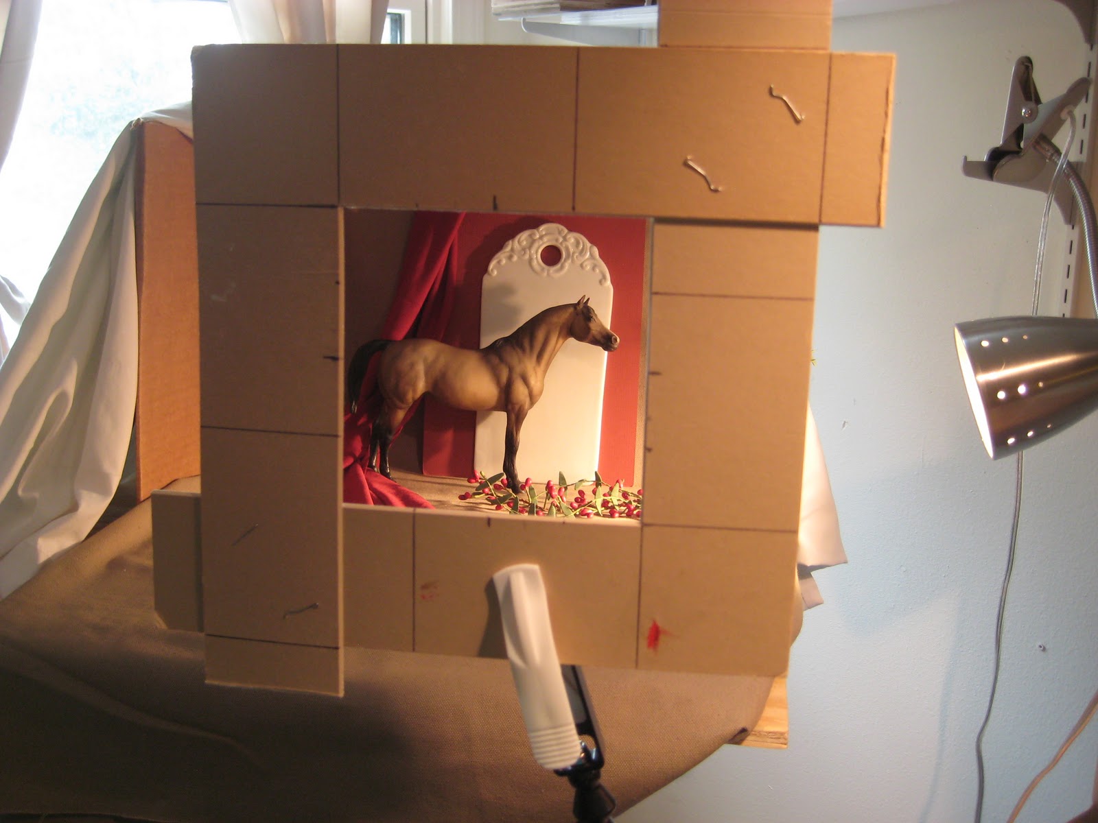
The Finish

I started by painting in areas of  the horse, moved to areas of the background and foreground, tackled the bottle since I had the surrounding area colors chosen and pretty much ended with the grapes. Then I jumped around filling in areas to tweak adding deeper shadows and highlights.


Monday, October 31, 2011

Two Apples for Two Birds 6" x 6" Oil on gessoboard


I painted the background first. The bird was the next thing I focused on and then I put spots of color on the apple to relate it to the bird with similar color. The metal pot gave me fits until I realized putting in the tablecloth and finalizing the apple would make it look more like metal by showing what it was reflecting. The bird shadow was next and the rest of the ceramic tray.

Monday, October 24, 2011

Orange Reflections 6" x 6" oil on gessoboard


The still life of the orange reflecting on the mayo bottle was incredible. But I decided to tone everything down a bit because the orange really did overpower the painting at one point. That delicate pink flower didn't stand a chance of being noticed if I had left it that way. It took me a while to come to that realization.

Sunday, October 16, 2011

Harvest Gold 6" x 6" oil on gessoboard

The joys of autumn! I loved the way the bottle softened and magnified the pumpkins. Almost ghostly.

Tuesday, October 4, 2011

Blue Bottle with Lemon renamed To the Rescue 6"x6" Oil on gessoboard


Well what it lacks in name, I think it makes up for in form. I really liked the way this painting developed. I didn't fiddle too much with stuff so it kept its' freshness. After I set the still life up, I kept moving the light fixture around until I got an interesting composition. It is amazing how when that is right, it will motivate me to follow through with painting it. I guess the old saying is true- you can't paint what you are not excited about.

Tuesday, September 27, 2011

Delf Creamer 6" x 6" oil on gessoboard


I started this painting as I usually do using a value sketch on the board using burnt sienna as my only color. I feel I could have eliminated corrections during the painting process had I spent more time either using the vine charcoal or even a pencil and paper to get more familiar with the form of the creamer. The direction that the creamer faces proved to be more challenging than I had realized. It is one of my softer paintings-not too much contrast in value. Sweet. The value of the creamer was first painted in before evening thinking about the windmill scene. That was the fun part!


Thursday, September 8, 2011

Jeepers Peepers 6" x 6" Oil on gessoboard

I do not use black on my palette. A lot of artists feel the same. It seems too harsh so I mix Alizarin Crimson, Ultramarine Blue, and Raw Umber together to get a close-enough black. It produces a more rich color instead of a vacant black hole.
The painting turned out a bit on the whimsical side.  Oh well.

Wednesday, September 7, 2011

Left Behind 6" x 6" oil on gessoboard


This painting sat for a while. I couldn't put my finger on the problem but eventially it surfaced. The original flower was pale and washed out, the bottle on the left did not reflect enough colors from the other two objects and the glass in the middle, well I am still not sure about it. There reaches a time when you take the brush away from your other hand and say "move on!".  Why the title? Ask my daughter.

Wednesday, August 17, 2011

Vaseline Jar? Oil on Gessoboard 6" x 6"


I found that little green jar at Goodwill. It probably isn't a collectible Vaseline but if it is, what a great deal for 99 cents!

Tuesday, August 16, 2011

Cafe Gambino Show


Several of my minature paintings will be on display at Cafe Gambino for the months of September and October. The opening for the show will be Sunday, September 11, 2011 from 2:00- 4:00. It is located in Metaire, La. on Veterans Hwy.
Hope to see you there.

Monday, August 15, 2011

Pair of Bottles Oil on Gessoboard 6" x 6"


Looking down on the bottles meant the sides of the bottles would not be parallel to the side of the gessoboard. I had to keep that in mind as I worked back and forth from bottle to background. Overall I like the softness of the painting. I did not get too picky with the details. 

Pair of Bottles


Yes, I have been bottle shopping. I found the brown bottle in an antique shop on the discount shelf! And the other, which contains oil to lubricate fishing reels, at a local consignment shop. What treasures!

I started with a sketch using burnt sienna. This helped me to see the shapes and shadows before committing to the color. I was happy with the negative space along the top, and the light shining on the back pear through the brown bottle, and the light shining through the front bottle. There was a pleasing movement to the whole painting.

Monday, July 18, 2011

Blue Horse 6"x6" oil on gessoboard


Well the cookie cutter horse isn't really blue- it's metal. It does catch a lot of blue from that deep blue milk of magnesia bottle. So I guess I can justify the title of  "Blue Horse". The biggest challenge with this painting for me was the jar of medium in the left corner. I almost changed the color of the lid to a light red but decided against it.  I decided that the blue-orange complement with analogous colors was enough to make it work. I am pleased with the composition on this painting.

Sunday, July 17, 2011

Blue Horse - Sketch- 6"x6" charcoal


Since this painting has a bit more compostion going on than most of my small paintings, I decided to sketch it in first with charcoal on my gessoboard. Vine charcoal is very forgiving. It can be wiped out in a second with tissue paper if mistakes need correcting. I was glad I did this because the first tonal testing (bottom) proved off balanced. I admitted it reluctantly after taking a photo to post. The next tonal (top) testing seemed more pleasing.

Tuesday, July 12, 2011

Hexagon Mystery Box 6"x6" oil on gessoboard


Question. How does a hexagon recede in a distance. I am familiar with a 4 sided box perspective but I don't think this one follows the same rules. All the lines of one side has a vanishing point but when you see the opposite side, is it parallel to those lines or do they recede also and if so, is it to the same vanishing point. Perhaps there are three vanishing points. Who knows. I only ask because, as Roma Quartana would have said it, I had a devil of a time trying to figure that one out.

I learned a lot from this one. 1) paint more often 2) don't use burnt umber as the undertone because I had trouble covering the white areas later 3) don't put oil paint in the refrigerator to keep- no comment 4) get the perspective right before painting. Well that about does it I think.

Thursday, May 26, 2011

Mandarin Tea 6" x 6" oil on gessoboard

This was a fun one to do. I enjoyed painting the mandarins because there was such a variation of color from the shadow to the highlights as well as the reflection of the white cup.

Thursday, May 19, 2011

Good Knight 6" x 6" oil on gessoboard

I was intriqued by the light going through the amber bottle.  The influence of color was more intense on the horse than how I have painted it. But I am pleased with the color mixes that I made for the shadows. I think I got that right.

Wednesday, May 18, 2011

"I Love You This Much" 6" x 6" oil on gessoboard

I admit when my mom and I played that game, our arms would be opened much wider. But the little salt shaker ( who is missing her pepper partner) found a new love. What a pair they make!

Friday, May 13, 2011

My Favorite Veggie 6" x 6" oil on gessoboard


The challenge of the week:  paint my favorite veggie. I know there are two veggies in the painting but the summer squash looked so cute when I put it next to the bell pepper, I had to keep it in the still life. I like bell peppers because they add that "something special flavor" to dishes, especially red beans.
After setting up this still life, I realized I used analogous colors on the color wheel that ranged from yellow to blue-green and used the complement red-violet for the background. I used a smooth-toothed canvas which takes some time getting used to. If I were to do this painting over, I would spend more time on the value sketch before progressing with the painting.

Friday, May 6, 2011

Me- Parts anyway 6" x 6" oil on gessoboard


The Self Portrait challenge. Not something I would have chosen, Lord knows but here it is. The face seems a little wide but perhaps it needed a stronger shading along the side of the face. Well finished no matter what. I learned a lot especially not to try another self-portrait!

Me- The beginnings- the value sketch


Ok, I played with this thing long enough to try to make it look like the photo. Even though it doesn't look like me, well maybe some parts do, I still had a lot of practice in placing the values... dark against light, light against dark. Always the same thought process for me.

Me -Photo


This week's challenge: self portrait. I took a zillion photos of myself holding the camera at arms length. Finally I got a few that I felt that I could work with. After chosing the final cut, I went into my photo shop and changed this photo to a black and white so that I could more easily see the subtle value changes when I began to paint. Then using the same program, I used an artist brush to soften the look. This eliminate some unnecessary details.

Wednesday, April 20, 2011

Lost Marbles 6" x 6" oil on gessoboard


From this week's challenge I chose to use the primary colors on the Color Wheel. The predominant color is red (pink), secondary is blue and the least amount of color used is yellow. The biggest challenge was to mix a neutral gray for the glass. The grays ranged from a warm yellow gray to a cool blue gray.

Tuesday, April 12, 2011

Cock-a-doodle-doo 6" x 6" Oil on canvas


This is the "chicken challenge" for the week. I changed the background to blue-violet from the original photo which had several different colors. I decided to keep the whole painting in the analogous color range with the two adjacent colors on either side of red.
What a homely little fellow.

Tuesday, April 5, 2011

German Landscape Challenge


Well maybe it doesn't look anymore like Germany than down the road from here. Lots to learn about landscape painting. I pulled out my book by Morgan Samuel Price to get an idea of what color scheme I wanted to use because the photo that I painted from left a lot to be desired- to me anyway. If you wish to visit the website where I am taking all these Challenges, it is http://www.dailypaintworks.com/Challenges. It is interesting to see the interpretations of many different artists.

Monday, April 4, 2011

Lemon Aid 6" x 6" Oil on gessoboard


This brave little lemon is trying to rescue his friends by standing on the lid cover. Lots of luck!

Friday, April 1, 2011

Tradition Continues 5" x 7" Oil on canvas


Painting over the value sketch, I tried to match the same values when mixing the colors. Where to start? I decided to first get the skin values in the light and shadow on the face. I knew it was light in value but not as light as the rim of the cup, the milk carton, and the powdered sugar on the beignets.

I am thinking about entering this painting in an exhibit at the Southeast Louisiana University President's home in Hammond. If it is accepted, it will hang there for a year and will be in a lovely catalog along with other local artwork.

Thursday, March 31, 2011

Tradition Continued Photo and Sketch 5" x 7" oil on canvas

I took this photo of my grand daughter the day I introduced her to beignets at Morning Call. By the time she was finished she was wearing most of the powdered sugar that did not reach her mouth. I was drinking the Cafe au Lait while she sipped on her chocolate milk.  
After making a 5 x 7 inch print of the photo in grayscale, I folded the print in halfs and in quarters both length and width. I then marked the edges of the print with a pen so that I could easily see where the folds of the paper were. I marked the 5 x 7 inch canvas with the same divisions on the edges. How much easier and accurate to sketch it on the canvas this way! Notice I eliminated the cup in the middle of the photo and just extended the milk carton. I changed some of the values from the photo in order to help the composition.

Shadow Bigger Than Life 6" x 6" oil on gessoboard

When I put together this still life, the colors of the blue-green background, the red-violet flower and the muted red-orange tablecloth seemed pleasing together. Looking on the color wheel I realized that I was using the tertiary colors. No wonder they looked good. And the white bottle takes on the colors of the surrounding area so it unites these tertiary colors.

Even though I got too tight with this painting, I am happy with the results. The flower could have been a bit smaller and closer to the bottle. But the stem does pull both together and the wall shadow helps too. The composition was risky and maybe it is not the best, but certainly not the worst I could have come up with!

Tuesday, March 29, 2011

Shadow Bigger Than Life - Sketch 6" x 6" oil on gessoboard


I am depending on this bottle shadow on the back wall to pull this painting together since both bottle and flower only connect with a stem. We'll see.

I tried to get a handle on the values so that when I start the painting I can be more aware of the dark against light, light against dark dynamics. For the sketch I used Burnt Umber and turp. Lifted out the light areas with turp and used more umber for the darks. This will be my underlay for the start of my painting. Now all I have to do is fill in the blanks with the correct color values!

Friday, March 25, 2011

Color My World 6" x 6" oil on gessoboard

The Challenge: To paint a white object against a background of primary and secondary colors. No earthcolors on the palette. The study is to help the artist see the surrounding colors in the white object.

I debated whether to paint the white object in first or the surrounding material. Gut feeling led me to the white object first. It was important to get the values right on the bottle first in order to play the light against dark, dark against light game against the background.

I found that the colors that reflected on the bottle were more noticiable on the shadow side of the bottle. I think this was because the bottle had a soft luster to it rather than a high gloss. It definitely glowed with its surrounding colors. It was awesome. I hope the finished painting did it justice.

Saturday, March 12, 2011

The Red Box

A blank canvas can be a daunting thing. But a painting gone bad is even worse. Being the day after Mardi Gras I thought I would paint something with green, purple and gold. I chose a Cupie doll; that doll with the big eyes that could have been a forerunner to the Precious Moments.  Even had the title picked out "Hey Mister Throw Me Something". Yes the title a bit trite and possibly over used. The painting was doomed to start. The lighting on the set up was too harsh and the doll was looking more and more like Chucky. Really scary. It was one of those situations when enough was enough. It is a humbling thing to admit defeat. But there I said it. I pulled out my little red box that Carol Marine gave us at the workshop to make sure it was closed up tight.
The next painting will be better. How could it get any worse!

Tuesday, March 8, 2011

Abe Lincoln Challenge


This weeks challenge was to paint old Abe in either of three ways. I chose using Ultramarine Blue and Burnt Umber with Permalba White for adjusting the tones of the painting. (Taking the photo of the painting still wet continues to createn reflection issues. The bluish area on the right side of the head is really a deep value.)

Well ok he looks like a cross between Abe Lincoln and Pierce Brosnon, what's wrong with that? Maybe you see someone else there instead. All in all not being a portrait artist, I think it came out ok.


I first mixed a large batch of  equal parts Ult blue and Burnt umber. Layed in the sketch with this mixture wiping out with a rag for the lights and using less turp for the darks. When I got an image that looked half human, I started adding variations of the white to this mix to do the overlay. It really was fun to do.

Saturday, March 5, 2011

The Magnificent Green Apple 4" x 4" Oil on gessoboard


Yes another bottle. What a wonderful magnifier it became when the green apple was placed behind it! I feel the brush strokes on this painting has given it a more painterly look which is my major goal. I changed the color of the background midway through. I had a midtone blue green but with that "thalo" green apple I wanted something more subdued but yet would help it pop. So I chose gray green which I mixed by using a significant amount of cad reds and alizarins for the graying process. That hint of red in there seemed to have done it's job. However I still wonder had I used a red violet gray in the background if that would have been better. What do you think?

The Magnificent Green Apple Sketch 4" x 4"

I have decided to start another paint challenge like the last, hoping to be more aware of each stroke without the blending. Here is the value sketch, a real general idea of light direction, medium and dark tones. The composition looks balanced and pleasing to the eye. The negative space is interesting. So the color mixing begins.

Thursday, March 3, 2011

"Oh I Wish..." 4" x 4" Oil on gessoboard


The challenge- Mix a color spot, put it down, mix another, put it down.... It is an excellent exercise in seeing color spots and their relationship next to one another. The final painting should look kind of patchy. No blending!  OOPs I did blend a little in some areas. I had a devil of a time keeping the patchy look on the label using only the half inch bright brush. All in all I think it made me looser. I think I will do another setup and do that challenge again. I love the look.

I am supposed to be looking down on the bottle. I hope that came across ok. I think I can do better next time.

Tuesday, March 1, 2011

Oh I Wish... Sketched in on gessoboard 4" x 4"


This week's challenge is to paint by being aware of each stroke of color. Mix a color, make a stroke, mix another, make a stroke. Very tedious but Carol gaurantees that it will get me looser. I am willing to become a "looser" artist.


This is the start of the painting. I chose another bottle. No I don't get tired of painting bottles! I first toned my background with Burnt Sienna. Then I sketched in my bottle with the same color.  I wiped out to get my lights, and the dark tones I added more burnt sienna. Now I am ready to add the colors.

Can you guess what the bottle is by the Title?