
Tuesday, February 14, 2012
Bed and Breakfast Uptown N.O. 6" x 6" oil on gessobord

Wednesday, February 8, 2012
Prytania Street Home II 6" x 6" oil on gessobord

I was debating on whether to add foilage on the upper left area of the painting. Magnolia leaves or such. But I decided to stay purely archectural instead. I like the division of space when I cropped a larger photo into this closeup view
Monday, February 6, 2012
Musical Trio 6" x 6" oil on gessobord

I thought this painting was going to be a challenge but it turned out to be really fun. I still have memories of the night I took the photo at Paton's Restaurant at an art openings which I shared with several other local artists.
Friday, February 3, 2012
The Courtyard 6" x 6" oil on gessobord

This is the photo that I cropped into a square using my computer program. Notice the red pen marks that divide the photo.

"The Courtyard" 6" x 6" sketch
Going through photos that I had taken some time back, I made a folder on my computer with all the ones that I thought had good composition for a potential painting. This was my favorite. You can see the grid that I drew on the canvas, which helped me to sketch from my photo. ( I put the photo in a sheet protector and divided the photo in the same manner as the canvas.)

"The Courtyard" 6" x 6" oil
This was a study in pastel shades of color. The day was overcast when I took the photo. You can see that when I took the photo of the finished painting, my camera plane was not the same as the canvas, so the edges are off after cropping for posting. OOPS.

"Columbia Street" sketch
This is the sketch the I did in vine charcoal first. Yes I have a heavy hand when it comes to sketching, but after I paint over the lines with my cerelean blue, I wipe it off with a towel and the charcoal is basically gone. Notice again the grid that helped me to copy from the photograph.

"Columbia Street" 6" x 6" oil
I like the depth that I was able to achieve by using both linear perspective and color perspective. The red "open" sign and the red shirt in the distance helps give this the depth. The front window is the sharpest edges.
I think the original painting looks nicer than this photo that I took. I might give it another go on a sunnier day.

"Prytania Street" Sketch
This is only a sketch. Nothing is in stone if I don't like it. For instance that front column is angled slightly too much.

"Prytania Street Home" 6" x 6" oil
I like the angle of this shot. It gives me the feeling of the magnificence of this beautiful home.
Monday, January 30, 2012
Next Best Thing to Heaven 5" x 9"
Next+best+thing+to+heaven.jpg)
Larger Paintings
No I did not fall off the face of the planet. I know it has been a while since I posted. I have been busy with "larger" paintings- 16" x 20". I thought I would share some of these with you. They are more time consuming of course to paint than the smaller ones. The 6"x6" paintings have been such a tremendous help in fine tuning my value skills and color mixing. I will be getting back to them very soon.
crop+Morning+Thoughts.jpg)
"Morning Thoughts"
I enjoyed doing this painting I think because I like the architecture of old buildings. I hope to get into New Orleans soon and take some more reference photos.
State+your+business.jpg)
"State Your Business"
Thanks to my elder son and his photography, I was able to get a good reference photo for this painting. Those roosters would have been hard to paint on location!
Madisonville+boat+on+Tchfuncte.jpg)
" Madisonville Boat on the Tchefuncte"
My youngest son already stated claims to this painting. He is my biggest art collecter of my work in the family. I am so fortunate that all my children have an appreciation for art. I guess I dragged them to enough galleries and shows when they were younger.
My+Girls.jpg)
"My Girls and Honky Donkey"
I keep changing the faces. Help! I am afraid to show this to my daughter yet. She is so much more prettier than the painting and my grand daughter also! Might need to hide it in a closet.
P.S. Honkey Donkey still resides with us, a favorite stuffed animal of my kids. Well two of them anyway.
 These are some changes that I decided to make. The foreground water is more constrasty and has more interest, the fishing pole was added and I put some birds in the trees and in the sky to add more life to the landscape. Yikes the faces are giving me challenges. But for now they will have to do. Time to move on.

Hillcrest+memories.jpg)
"Hillcrest Memories"
This one is still in progress. Several additions needed like a fishing pole in Paw Paw's hand, some facial changes and also I want to work more on the forground reflections and water image. Even though there are three people in the painting, I still feel the painting is serene.
Monday, December 19, 2011
The White Filly 6" x 6" oil on gessoboard

The little filly was painted using various shades of light grays. From cool pinks and violets to warm yellow ochres. It helped tie the bottle and the flower together.
Wednesday, December 14, 2011
Stage Left 6" x 6" oil on gessoboard

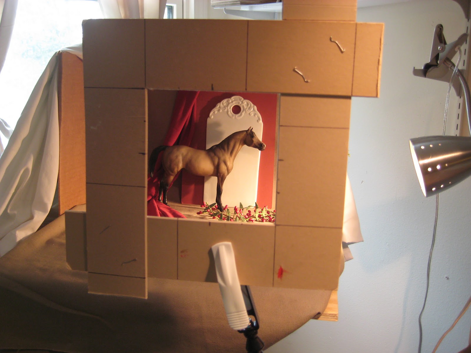
Breyer horses are so great to paint. They are the next best thing to a live model.

After a few minutes, I wiped out the whole thing with a clean cloth. It left a toned canvas and the image as a line drawing. It seems sometimes that it is a lot to go through but I wanted to make sure I got a better feel for the direction of lines and form of the subject. Now for the color.

This is the finished line work using burnt sienna oil on a paint brush.

I sketched the setup onto my gessoboard using vine charcoal. I smudged for halftones and used a kneaded eraser to lift the lights. Yes, a thumbnail sketch on a sheet of paper would have done the same but now I can just do the line work right over this with burnt sienna to get started with the painting.
Wednesday, December 7, 2011
Granny's Closet 6" x 6" oil on gessoboard

Ok, why the title? I remember my grandmother with a navy blue dress with white polka dots.
This feather stuff is getting kind of fun to paint. Haven't quite figured out the best way to layer it yet.
Designer Clothes 6" x 6" oil on gessoboard

If this rooster didn't look like it belonged down a runway, I don't know what rooster would. His pose formed an abstract design that cried "paint me".
I chose a dark gray green background to complement the focal point of the head and provide a nice contrast.
Fancy Feet - second attempt 6" x 6" oil on gessoboard

Today was still overcast but a bit brighter so I decided to make another go of it and take another photo. For those eagle eyes, yes I did change a couple of things.
The thing I like best about this painting is that it plays the light against dark, and dark against light. The shadowed bottom of the rooster plays against the brighter green ground and the lighted top of the rooster plays against the darker background.
Tuesday, December 6, 2011
Fancy Feet 6" x 6" oil on gessoboard

I usually take a photo of the finished painting in a hall that has a high window. The ambient, natural light usually gives the true colors of the painting. Today was rainy and overcast. It was more of a struggle to take the photo than paint this fancy fella. The glare washed out some of the more delicate areas of the painting. If tomorrow is a nicer day, I will try to photograph it again. Really, the painting looks much nicer. Really.
Everytime I looked at this fella's "feet", it reminded me of a Clydesdale. (It's just the way I think.)
Wednesday, November 30, 2011
Here A Minute Ago 6" x 6" oil on gessoboard

Thursday, November 17, 2011
Back In the Saddle Again 6"x6" oil on gessoboard

The Line Drawing
This was a more complicated composition for me because of the horse so I wanted to play with it a while by using vine charcoal. Very forgiving. Just wipe it out with a tissue and start over if you don't like it.

The Value Sketch
After doing the line drawing with vine charcoal, I smudged areas with mu finger or pulled out whites by using a kneaded eraser. I used a heavier hand using the vine charcoal to show the dark areas. A thumbnail sketch on a sheet of drawing paper would have done the same thing. I will use my still life to hone in on this for the final painting. The practice was important before I got started.

An Underpainting of Burnt Sienna
In order not to lose all that hard work, I loaded my brush with Burnt Sienna and did the line work again. Letting it dry somewhat, about five minutes, I took a rag and wiped the board. This helped eliminate any whites and toned my canvas.

The Finish
I started by painting in areas of the horse, moved to areas of the background and foreground, tackled the bottle since I had the surrounding area colors chosen and pretty much ended with the grapes. Then I jumped around filling in areas to tweak adding deeper shadows and highlights.
Monday, October 31, 2011
Two Apples for Two Birds 6" x 6" Oil on gessoboard

I painted the background first. The bird was the next thing I focused on and then I put spots of color on the apple to relate it to the bird with similar color. The metal pot gave me fits until I realized putting in the tablecloth and finalizing the apple would make it look more like metal by showing what it was reflecting. The bird shadow was next and the rest of the ceramic tray.
Monday, October 24, 2011
Orange Reflections 6" x 6" oil on gessoboard

The still life of the orange reflecting on the mayo bottle was incredible. But I decided to tone everything down a bit because the orange really did overpower the painting at one point. That delicate pink flower didn't stand a chance of being noticed if I had left it that way. It took me a while to come to that realization.
Sunday, October 16, 2011
Harvest Gold 6" x 6" oil on gessoboard

Tuesday, October 4, 2011
Blue Bottle with Lemon renamed To the Rescue 6"x6" Oil on gessoboard

Tuesday, September 27, 2011
Delf Creamer 6" x 6" oil on gessoboard

I started this painting as I usually do using a value sketch on the board using burnt sienna as my only color. I feel I could have eliminated corrections during the painting process had I spent more time either using the vine charcoal or even a pencil and paper to get more familiar with the form of the creamer. The direction that the creamer faces proved to be more challenging than I had realized. It is one of my softer paintings-not too much contrast in value. Sweet. The value of the creamer was first painted in before evening thinking about the windmill scene. That was the fun part!
Thursday, September 8, 2011
Jeepers Peepers 6" x 6" Oil on gessoboard

The painting turned out a bit on the whimsical side. Oh well.
Subscribe to:
Posts (Atom)