I have been a member of the Southeast Louisiana Branch of the National League of American Pen women for almost 20 years . The members incude writers, musicians, and artists. The headquarters is in Washington D.C., close to the Smithsonian. It is an old organization which dates back to 1897.
I encourage you to check out the webpage http://www.nlapw.org/
A new website has been designed on youtube showcasing some of its members and a piece of their work. They happened to use me as their "cover girl" for the youtube. Don't ask me why.
https://www.youtube.com/channel/UC7373t8VvyqUn0scVA6f32w
Friday, April 18, 2014
Tuesday, April 9, 2013
"Altar Boy" oil on canvas 16"x20"

My friend Dottie and I decided to paint this boy from a newspaper clipping that she had cut out years and years ago. . It is a black and white photo. (Colored print in the Times Picayune were rare in those days.) This boy is no doubt married with 10 kids by now. Anyway, she is working on the watercolor version and I am anxious to see her results.
Friday, April 5, 2013
New Orleans French Quarter Festival April 13th and 14th.
It is that time of the year again. I have been accepted into the Pirates Alley Art Show that takes place in conjunction with the New Orleans French Quarter Festival. Please come visit me and view my latest work. My spot is actually on Pirate Alley which is on the left side of the St. Louis Cathedral. There will be different bands and great food throughout the area. Hope you can make it!
"King of the Road" 16" x 20" oil on canvas

Julie and Manny 16" x 20" oil on canvas

Everything was first sketched in loosely with soft charcoal, followed by yellow ochre to make the lines more permanent so that I could block in the shapes. Same procedure as the smaller paintings.
Tuesday, March 12, 2013
Roy and John 16" x 20"

This is at Roy's studio. He has a life sized poster board of his idol, John Wayne behind him always keeping an eye on what he is painting. It was morning light and I basically painted from life as he painted. I had to take a photo though to do the finishing touches on it when I got home. It took about 3 sittings to complete. The studio facinated me with all the interesting "art" stuff laying around. Imagine that!
Just Country 16" x 20" oil on canvas

Wednesday, March 6, 2013
Super Trio 12"x 12"

Yes, I did this painting before but it was worth repeating on a slightly larger canvas board. If only you could really see the rich colors that are in the "blacks". I used no black paint, only mixtures of red, yellow and blue in their deepest values.
Monday, October 29, 2012
Renaissance Girls Oil on canvas 12" x 12'

What a great opportunity to get some interesting reference material at Renaissance festivals. I really like this painting because of the loose brushwork. Working on a bit larger surface 12" x 12" gave me an opportunity to explore the delicate colors of the white horse and the shadowed areas under the girls hat.
Tuesday, April 17, 2012
Lagniappe

I think there is no greater joy for an artist than to see people admiring their work, well, and selling it too. Ok playing with grandchildren is up there on the list.
The French Quarter Festival was grand. I came home looking more like a crawfish though- red. I am looking forward to attending it again next year. Thanks to all my friends and family who made the special effort to come and visit me. And to my son who took all those great reference photos.
Friday, April 13, 2012
The Old & the New 6" x 6" oil on gessobord

Thursday, April 5, 2012
French Quarter Festival New Orleans, La. April 14th and 15th
Come visit me at the French Quarter Festival. I will be one of many artists at the Pirates Alley Art Show which is going on in conjunction with the festival. You will find me at the corner of Royal Street and Pirates alley, behind the St. Louis Cathedral. I would love to see you! There will also be great food, great bands and a great time. Hope you can make it! Check out the French Quarter Festival website for a full schedule of the bands and their locations.
Tuesday, March 27, 2012
New Orleans Neighbors 6" x 6" oil on gessobord

What is the focal point? I want to say it is the dog and the lady leaning over to pet it. The woman to the right was intentially painted softer for de-emphasis and the couple in the back, although they are waving do not take center stage. The canopy and the poles initially caught my attention when I looked at the photo. OK the couple in the back wasn't in the photo but I decided to add them because I liked the connection they bring to the foreground.
Friday, March 23, 2012
Lafitte's Blacksmith Shop 6" x 6" oil on gessobord

Ursulines Street Corner 6" x 6" oil on gessobord

Tuesday, March 20, 2012
Chess Anyone? 6" x 6" oil on gessobord

I am told that this fellow was already a master chess player when he was starting LSU. He seemed quite at home in front of the French Market.
What a great profile study!!
Wolfe's Corner 6" x 6" oil on gessobord

I like how the colors in the focal point, the buggy and mule, are repeated in the blue sky and the red canopy & roofs, and the rust of the building. It pulls it all together. The only thing I wish I would have done was to maybe put some more figures in the distance to give it more life. What do you think?
Friday, March 9, 2012
Court Tavern Po-Boy 6" x 6" oil on gessobord

The things that attracted me to paint this were wrought iron work against the intense background colors of the buildings. It screams New Orleans. By the way, the iron work was predominantly done by using an old credit card. It is a great straight edge for fine areas.
Canal Street Car 6" x 6" oil on gessobord

Does the angle of the side of the streetcar disturb you like it disturbs me? I keep looking at my reference photo with the grid lines and it tells me that it is correct but something seems off. Perhaps the tracks and the curb angle needs tweeking. What do you think?
Thursday, March 8, 2012
Lucky Dogs 6" x 6" oil on gessobord

The thing that attracted me to paint this, aside from the fact that it is so New Orleans, were the dynamic angles and repetitive "stripes" on the shirt, railing and steps. The shirt was easier to do once I figured out to put the variations of red on first and wipe out the white lines with a rubber gadget.
Meet Me at St. Louis 6" x 6" oil on gessobord

Sunday, March 4, 2012
Dumaine Street Stop 6" x 6" oil on gessoboard

I found out that you can take some pretty descent reference photos cruising down the streets of New Orleans in my car. No, I did not do both. I drove and my son with his super duper camera shot through the closed windows. When all was said and done, he managed to take 1500 photos. Yes 1500. It took me 3 days to go through all of them, crop, recrop, and make the final cuts of what I would like to paint. Twenty two photos caught my eye. This was the first one I painted. I am trying to get the hang of where to start a painting like this that has so much information. I decided to start from back, the sky and roof tops, to front - the buildings. It was an overcast day so there were no deep shadows.
Tuesday, February 14, 2012
Downtown Covington,La. 6" x 6" oil on gessobord

Bed and Breakfast Uptown N.O. 6" x 6" oil on gessobord

Wednesday, February 8, 2012
Prytania Street Home II 6" x 6" oil on gessobord

I was debating on whether to add foilage on the upper left area of the painting. Magnolia leaves or such. But I decided to stay purely archectural instead. I like the division of space when I cropped a larger photo into this closeup view
Monday, February 6, 2012
Musical Trio 6" x 6" oil on gessobord

I thought this painting was going to be a challenge but it turned out to be really fun. I still have memories of the night I took the photo at Paton's Restaurant at an art openings which I shared with several other local artists.
Friday, February 3, 2012
The Courtyard 6" x 6" oil on gessobord

This is the photo that I cropped into a square using my computer program. Notice the red pen marks that divide the photo.

"The Courtyard" 6" x 6" sketch
Going through photos that I had taken some time back, I made a folder on my computer with all the ones that I thought had good composition for a potential painting. This was my favorite. You can see the grid that I drew on the canvas, which helped me to sketch from my photo. ( I put the photo in a sheet protector and divided the photo in the same manner as the canvas.)

"The Courtyard" 6" x 6" oil
This was a study in pastel shades of color. The day was overcast when I took the photo. You can see that when I took the photo of the finished painting, my camera plane was not the same as the canvas, so the edges are off after cropping for posting. OOPS.

"Columbia Street" sketch
This is the sketch the I did in vine charcoal first. Yes I have a heavy hand when it comes to sketching, but after I paint over the lines with my cerelean blue, I wipe it off with a towel and the charcoal is basically gone. Notice again the grid that helped me to copy from the photograph.

"Columbia Street" 6" x 6" oil
I like the depth that I was able to achieve by using both linear perspective and color perspective. The red "open" sign and the red shirt in the distance helps give this the depth. The front window is the sharpest edges.
I think the original painting looks nicer than this photo that I took. I might give it another go on a sunnier day.

"Prytania Street" Sketch
This is only a sketch. Nothing is in stone if I don't like it. For instance that front column is angled slightly too much.

"Prytania Street Home" 6" x 6" oil
I like the angle of this shot. It gives me the feeling of the magnificence of this beautiful home.
Monday, January 30, 2012
Next Best Thing to Heaven 5" x 9"
Next+best+thing+to+heaven.jpg)
Larger Paintings
No I did not fall off the face of the planet. I know it has been a while since I posted. I have been busy with "larger" paintings- 16" x 20". I thought I would share some of these with you. They are more time consuming of course to paint than the smaller ones. The 6"x6" paintings have been such a tremendous help in fine tuning my value skills and color mixing. I will be getting back to them very soon.
crop+Morning+Thoughts.jpg)
"Morning Thoughts"
I enjoyed doing this painting I think because I like the architecture of old buildings. I hope to get into New Orleans soon and take some more reference photos.
State+your+business.jpg)
"State Your Business"
Thanks to my elder son and his photography, I was able to get a good reference photo for this painting. Those roosters would have been hard to paint on location!
Madisonville+boat+on+Tchfuncte.jpg)
" Madisonville Boat on the Tchefuncte"
My youngest son already stated claims to this painting. He is my biggest art collecter of my work in the family. I am so fortunate that all my children have an appreciation for art. I guess I dragged them to enough galleries and shows when they were younger.
My+Girls.jpg)
"My Girls and Honky Donkey"
I keep changing the faces. Help! I am afraid to show this to my daughter yet. She is so much more prettier than the painting and my grand daughter also! Might need to hide it in a closet.
P.S. Honkey Donkey still resides with us, a favorite stuffed animal of my kids. Well two of them anyway.
 These are some changes that I decided to make. The foreground water is more constrasty and has more interest, the fishing pole was added and I put some birds in the trees and in the sky to add more life to the landscape. Yikes the faces are giving me challenges. But for now they will have to do. Time to move on.

Hillcrest+memories.jpg)
"Hillcrest Memories"
This one is still in progress. Several additions needed like a fishing pole in Paw Paw's hand, some facial changes and also I want to work more on the forground reflections and water image. Even though there are three people in the painting, I still feel the painting is serene.
Monday, December 19, 2011
The White Filly 6" x 6" oil on gessoboard

The little filly was painted using various shades of light grays. From cool pinks and violets to warm yellow ochres. It helped tie the bottle and the flower together.
Wednesday, December 14, 2011
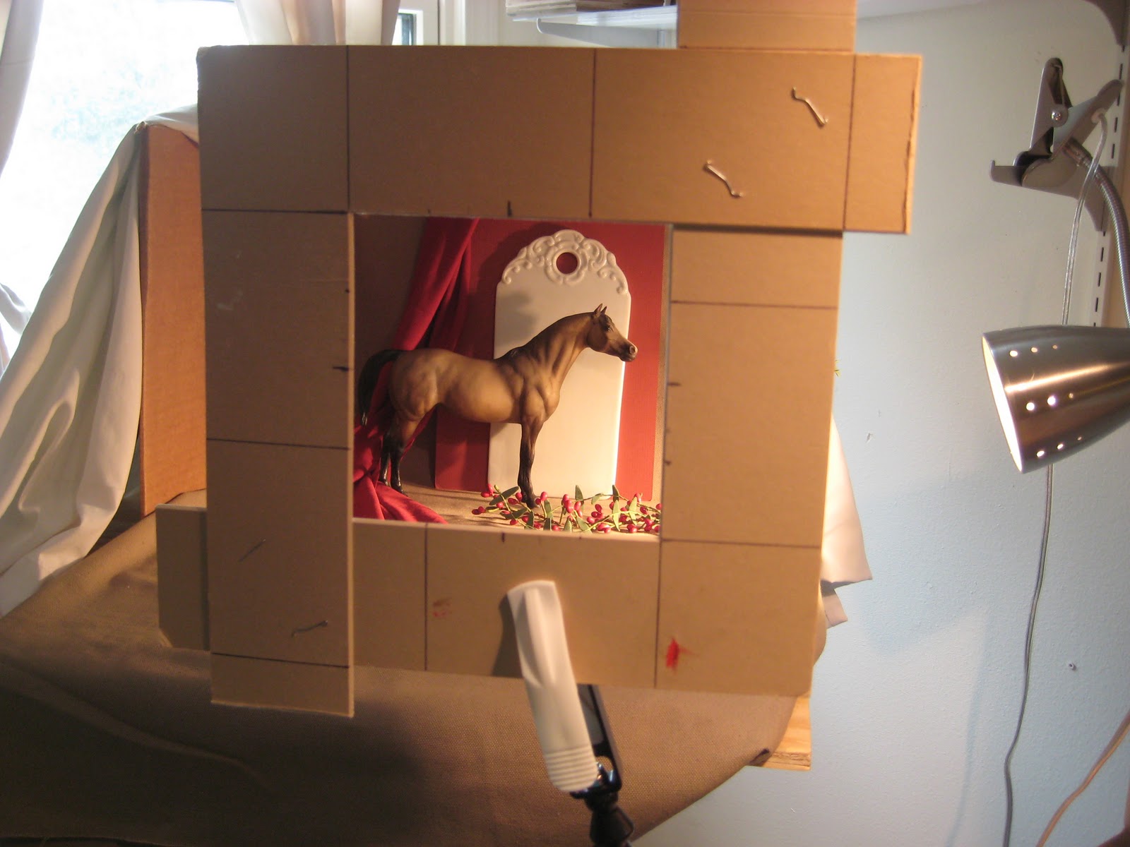
Stage Left 6" x 6" oil on gessoboard

Breyer horses are so great to paint. They are the next best thing to a live model.

After a few minutes, I wiped out the whole thing with a clean cloth. It left a toned canvas and the image as a line drawing. It seems sometimes that it is a lot to go through but I wanted to make sure I got a better feel for the direction of lines and form of the subject. Now for the color.

This is the finished line work using burnt sienna oil on a paint brush.

I sketched the setup onto my gessoboard using vine charcoal. I smudged for halftones and used a kneaded eraser to lift the lights. Yes, a thumbnail sketch on a sheet of paper would have done the same but now I can just do the line work right over this with burnt sienna to get started with the painting.
Wednesday, December 7, 2011
Granny's Closet 6" x 6" oil on gessoboard

Ok, why the title? I remember my grandmother with a navy blue dress with white polka dots.
This feather stuff is getting kind of fun to paint. Haven't quite figured out the best way to layer it yet.
Designer Clothes 6" x 6" oil on gessoboard

If this rooster didn't look like it belonged down a runway, I don't know what rooster would. His pose formed an abstract design that cried "paint me".
I chose a dark gray green background to complement the focal point of the head and provide a nice contrast.
Fancy Feet - second attempt 6" x 6" oil on gessoboard

Today was still overcast but a bit brighter so I decided to make another go of it and take another photo. For those eagle eyes, yes I did change a couple of things.
The thing I like best about this painting is that it plays the light against dark, and dark against light. The shadowed bottom of the rooster plays against the brighter green ground and the lighted top of the rooster plays against the darker background.
Tuesday, December 6, 2011
Fancy Feet 6" x 6" oil on gessoboard

I usually take a photo of the finished painting in a hall that has a high window. The ambient, natural light usually gives the true colors of the painting. Today was rainy and overcast. It was more of a struggle to take the photo than paint this fancy fella. The glare washed out some of the more delicate areas of the painting. If tomorrow is a nicer day, I will try to photograph it again. Really, the painting looks much nicer. Really.
Everytime I looked at this fella's "feet", it reminded me of a Clydesdale. (It's just the way I think.)
Wednesday, November 30, 2011
Here A Minute Ago 6" x 6" oil on gessoboard

Thursday, November 17, 2011
Back In the Saddle Again 6"x6" oil on gessoboard

The Line Drawing
This was a more complicated composition for me because of the horse so I wanted to play with it a while by using vine charcoal. Very forgiving. Just wipe it out with a tissue and start over if you don't like it.

The Value Sketch
After doing the line drawing with vine charcoal, I smudged areas with mu finger or pulled out whites by using a kneaded eraser. I used a heavier hand using the vine charcoal to show the dark areas. A thumbnail sketch on a sheet of drawing paper would have done the same thing. I will use my still life to hone in on this for the final painting. The practice was important before I got started.

An Underpainting of Burnt Sienna
In order not to lose all that hard work, I loaded my brush with Burnt Sienna and did the line work again. Letting it dry somewhat, about five minutes, I took a rag and wiped the board. This helped eliminate any whites and toned my canvas.

The Finish
I started by painting in areas of the horse, moved to areas of the background and foreground, tackled the bottle since I had the surrounding area colors chosen and pretty much ended with the grapes. Then I jumped around filling in areas to tweak adding deeper shadows and highlights.
Subscribe to:
Posts (Atom)